Synopsis.
Humanist Sans have sometimes a tendency to be over-roundish, slender, mannered, mimicking the calligraphy.
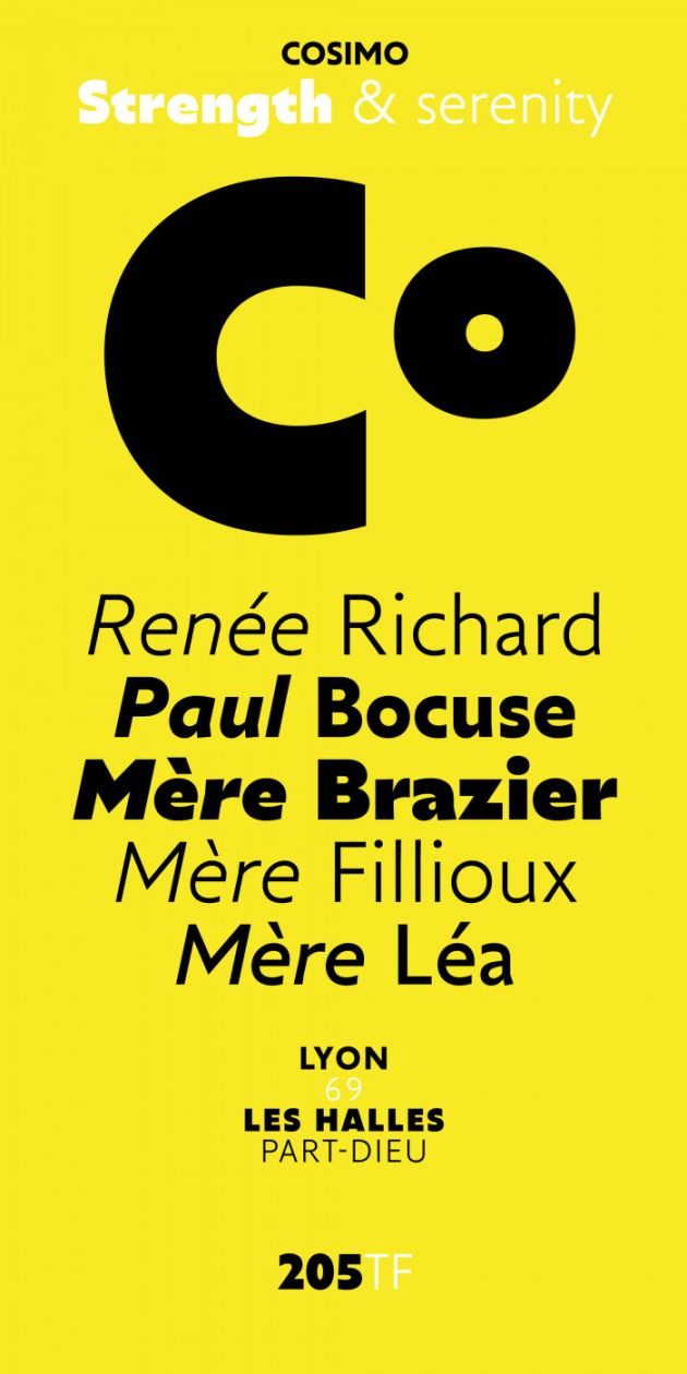
With Cosimo, Matthieu Cortat proposes a font in the spirit of Gill Sans, with strong shoulders, few contrast, a certain darkness in print, which gives it strength and serenity.
Contrarily to many font of this style, its italic remains simple and quiet.
With its clear and defined range of weights it possesses a versatility which makes it suitable for many purposes, book, titling, magazines, websites…
Nice light, straightforward Regular, virile Bold and peppy Black, each weight has a slightly different personality, but they match each others, making Cosimo a well-grounded font for every-day use as well as dressed-up layouts.