Synopsis.
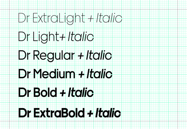
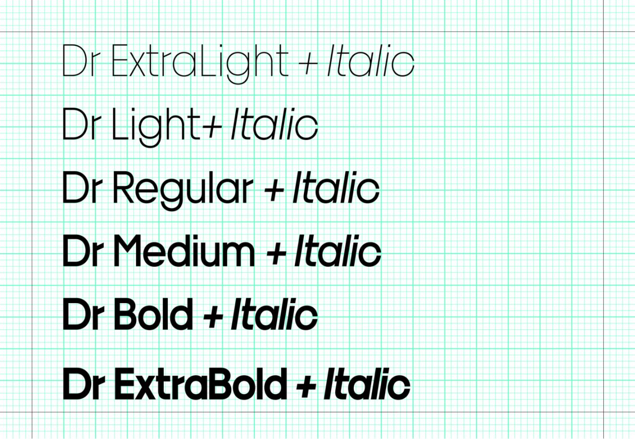
Dr is a curious kind of geometric sans serif. With only minimal optical corrections of the letterforms, widely differing proportions, and some preposterous looking design details a lot in this typeface seems weirdly off. As if artificial body parts had been affixed where the “normal” ones have gone missing. Bureau Brut initially developed Dr as part of the design for a medical company specialized in orthopedic prosthetics and implants for hands and wrists. The visual language signifies clear and precise surgical procedures.
Dr may seem crude at first sight, but the characters were constructed with similar surgical precision. Narrow apertures to the counter forms of the letters represent the preciseness of the medical products and procedures. These are also reflected in the letter fit: While the openings of characters like c or e as well as the spacing are still generous in the light weights, they get tighter and more closed as the weight increases across the family. Analogously, the distance between the i and its dot.